
Case Study — Derma Luxe
01 — The brief
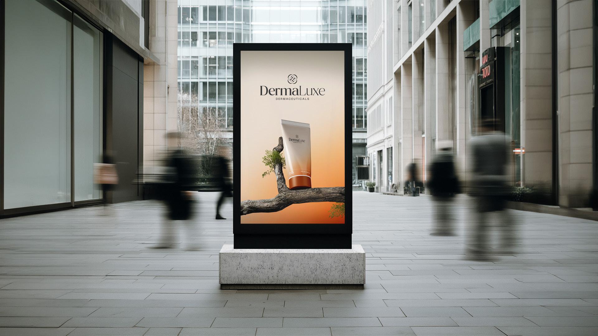
The client is an Australian-origin dermaceutical skincare brand entering the Sri Lankan market through professional recommendation channels, including dermatologists, cosmetologists, and beauticians. The client required a complete brand identity and visual design system that established clinical credibility while remaining premium and approachable across clinic environments, packaging, and digital touchpoints. Cyaniq was engaged to deliver the strategic identity foundations, visual identity system, tone of voice framework, and brand governance documentation ahead of market entry.
02 — What stood in the way
The brand entered the engagement without an established visual identity, positioning framework, or tone of voice for the Sri Lankan market. It faced a dual-audience challenge — building credibility with clinicians who recommend and prescribe, while remaining premium and accessible to a broad end-user base spanning teenagers through to mature consumers. Perceptual mapping revealed a competitive landscape dominated by well-resourced global brands including La Roche-Posay, CeraVe, Cetaphil, and Aveeno in the high-quality clinical tier, and by widely distributed mid-market brands across the cosmetic segment. The brand required a design system capable of reinforcing Australian provenance as a quality cue, navigating a professional recommendation model, and scaling across packaging, clinic collateral, merchandising, and digital channels from launch.
No established identity, positioning, or tone of voice at market entry
Dual-audience credibility requirement spanning clinicians and end consumers simultaneously
Competing against established global brands with high-quality clinical positioning
Identity required to perform across packaging, clinic environments, and digital surfaces
Australian provenance required to read as quality assurance rather than a country label
Design system required governance architecture for future product and SKU expansion
03 — How we delivered
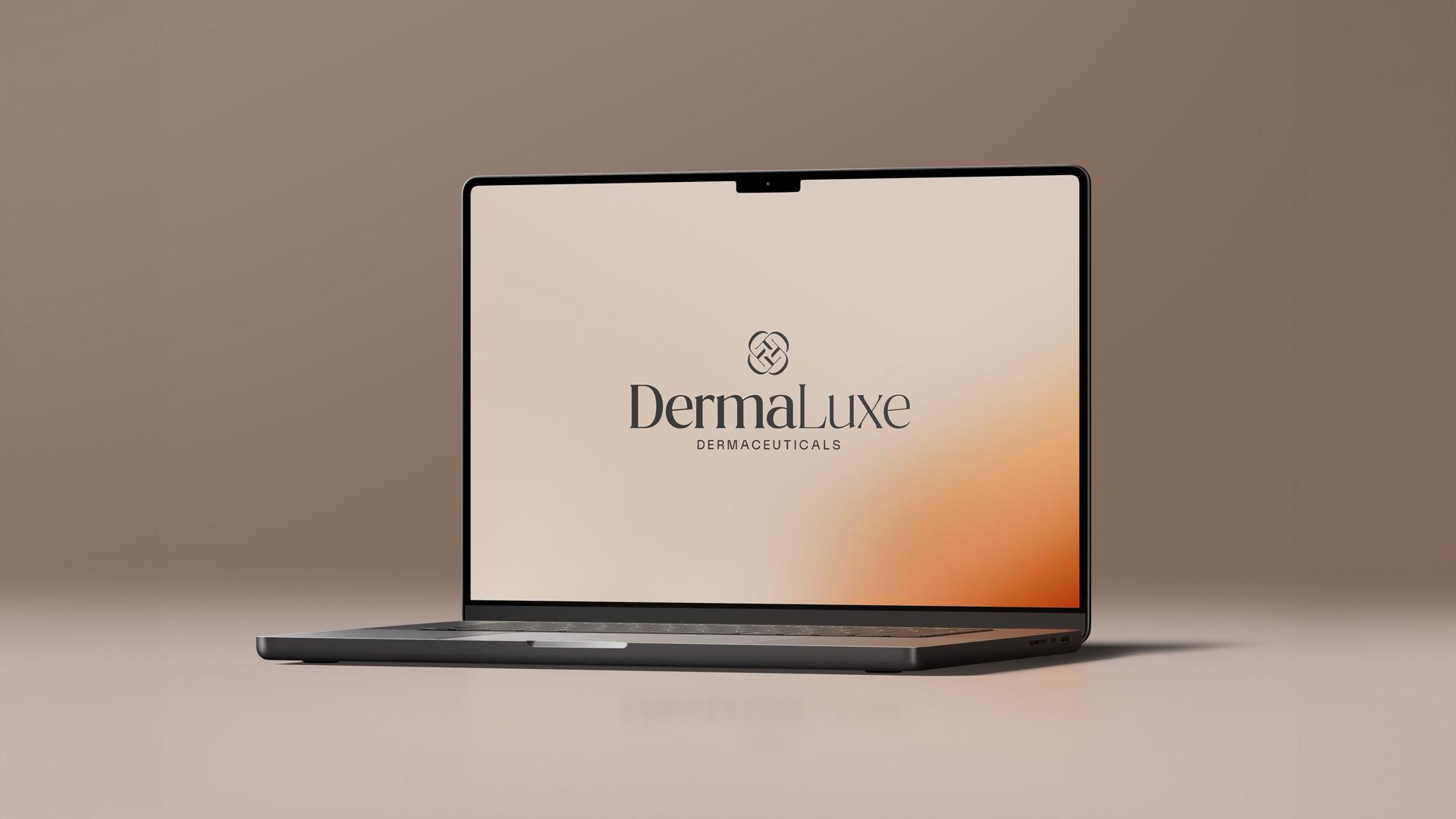
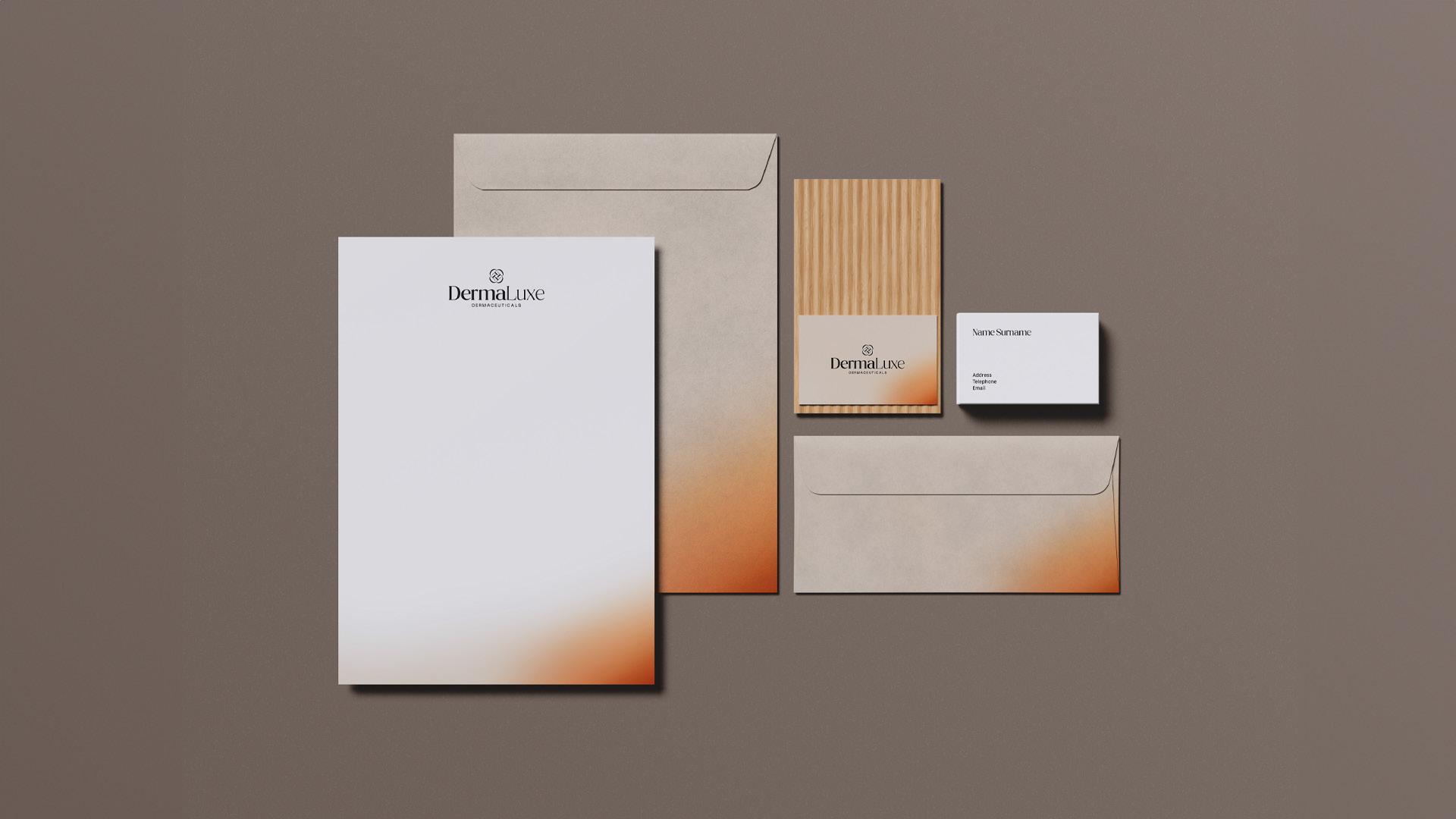
Cyaniq opened the engagement with a competitive perceptual mapping exercise, benchmarking the brand against global clinical and mid-market skincare competitors in the Sri Lankan market across quality, price, and positioning axes. This analysis informed a market positioning statement, three key differentiators, and a shortlist of six tagline options paired with marketing copy blocks across professional and consumer audiences. The complete visual identity system was developed from this strategic foundation. The brandmark combined letterforms from the brand name with a crystalline negative-space device, delivered across primary and secondary lockups with spacing rules, minimum sizes, and misuse guidance. The Meridian color system — anchored by Transformative Teal as a signal accent over a Porcelain Drift primary canvas — was selected and fully specified for print and digital production. A dual-typeface system pairing Masthic for brand expression with Poppins for supporting content was established alongside a repeatable pattern library. Applied standards were documented across business card, letterhead, signage, retail bag, merchandise, wrappers, and banners. An Australian Origin trust icon was delivered in three color variants, and all elements were compiled into a structured brand guideline documen
04 — What we delivered
Cyaniq delivered a complete brand identity system positioned for the clinician-recommended, high-quality tier of the Sri Lankan skincare market. The system established the brand's visual language, strategic positioning, and tone of voice from a foundation designed to perform across professional and consumer touchpoints without modification. The brand identity system provided the client with a scalable, governed identity capable of extending across future product launches, clinic point of sale materials, packaging, and marketing communications. The positioning framework, tagline set, and marketing copy delivered alongside the identity created a cohesive go-to-market foundation from which the brand could enter the Sri Lankan market with credibility and consistency.
Complete visual identity system delivered across primary and secondary logo lockups
Meridian color system specified in full HEX, RGB, and CMYK production values
Dual-typeface hierarchy established for packaging and communications use
Market positioning statement, three differentiators, and six tagline options with matched copy
Brand application standards documented across nine touchpoints including clinic and retail
Structured brand guideline document enabling governance by internal teams and external vendors
05 — How success was measured
Not Avalable
Next step
Turn market complexity into competitive advantage. Book a consultation to map your fastest path to clearer differentiation, stronger pipeline contribution, and a repeatable go-to-market system.